Why the Red Baron Still Inspires Designers: A Short Story of a Name, a Colour and a Skull
Some names carry a picture with them. Say Red Baron and most people see the same thing: a dash of red against the sky, the machine and the man in it, a legend that has outlived the century that produced it. That is a rare kind of power for a name to have, and it is exactly why designers keep coming back to it.
A name that became an image
The early years of military flight gave the world a new kind of hero and a new kind of visual language. Aircraft were painted to be recognised. Crews wore leather and goggles. Emblems and numbers turned machines into characters. Of all those images, one colour travelled furthest: a bold, uncompromising red.
In design terms the reason is simple. Red is the strongest colour in the palette, and the combination of red with white or black produces the clearest graphic contrast there is. It reads from a distance, it photographs well and it feels like a statement before a single word is read.
Red is not a colour you wear quietly. It is a decision.
From cockpit to street
Fashion has always borrowed from uniforms. Badges, patches, stencil lettering and worn olive fabrics have moved from the field into everyday clothes for decades. The attraction is a particular mix of discipline and rebellion: the order of a uniform, combined with the freedom of choosing to wear it for no reason except that it looks good.
Aviation imagery adds something extra, a sense of adventure and risk, and a graphic vocabulary of skulls, wings, numbers and insignia that translates beautifully to a T-shirt.
The skull and the bomber crew
The skull appears on military and flying emblems across many eras, usually as a signal of daring rather than of morbidity. On a shirt it works as a symbol, an instantly readable shape that can be drawn in two colours and still carry character.
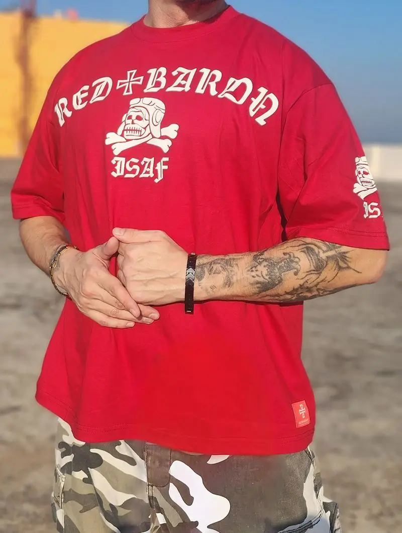
Red+Baron builds on that tradition with designs such as the ISAF T-shirt, a red and white bomber crewman skull, and others that follow a similar idea in different colours and settings, from a tank-crewman skull on dark grey to a desert-tan skull with a palm tree and a scorpion.
Red+Baron: an artist's version
The brand was founded in 2009 by artist T.T. James Gastovski. It is not a replica of anything historical. It is a personal, handmade interpretation that blends medieval, pseudo-military and sport influences, with every piece made from upcycled materials. Where the historical image is fixed, the brand's version is playful, graphic and a little ironic, and each garment is a small piece of art you can wear.
What a colour can say
Colour is the first thing the eye registers, and designers choose it deliberately. Red is associated with energy, urgency and courage, which is why it is used on warning signs, racing cars and sports kits. White gives red room to breathe and creates the sharpest contrast. Black brings seriousness. Olive and tan carry the associations of outdoor and field clothing.
Combine them and you are working with a simple, powerful vocabulary. A red and white skull reads boldly, a tan and black design feels weathered and practical, and a dark grey and white print has a harder, more industrial tone. Red+Baron plays with all of these in its collection, often with a touch of humour that stops the imagery from becoming too serious.
The language of insignia
Insignia exist to be understood quickly. Badges, numbers, shields and crests carry information in a small space, and that economy is what makes them such strong graphic material. A shield on a chest, a patch on a sleeve or a short code under a skull turns a plain T-shirt into something with a story.
The pattern repeats in the Red+Baron range: the ISAF shirt with its skull and lettering, the Fron+svin shirt with a war pig on a shield, the sleeve patch on the Boiled Blood Melted Skin shirt in the style of a USSR military badge. Each uses the language of insignia, but the tone is playful rather than literal.
What streetwear learns from uniforms
Uniforms solve practical problems: durability, recognition and function. Streetwear borrows their solutions without the obligations.
- Durable materials such as cotton, canvas and ripstop.
- Muted colours that are easy to combine.
- Functional details like pockets, straps and stitching.
- Symbols that identify a group, turned into personal statements.
The difference is freedom. A uniform tells you who you are; streetwear lets you decide.
Aviation style beyond the shirt
The influence of early flight on clothing goes far beyond graphics. Leather jackets, goggles, scarves and caps all started as practical equipment for people in open cockpits. Their shapes survived because they looked good as well as worked well. Today those silhouettes appear in jackets with fitted cuffs and collars, in caps with short brims and in boots with sturdy soles. When you see the same shapes repeat across decades, it usually means the design solved a real problem.
Why we like the contrast of serious and playful
Military imagery can feel heavy. Mixing it with humour, irony and artistic freedom makes it wearable. A skull in a flying helmet or a war pig in a medieval coat is clearly not a real uniform; it is an invitation to smile, and that is what makes the pieces comfortable to wear in everyday life. It is also what separates thoughtful pseudo-military design from simple imitation.
Why storytelling matters in clothing
People keep clothes that mean something. A shirt with a clear idea behind it (a symbol, a place, a joke) is easier to love than a plain one. That is the reason handmade and artist-led brands put so much effort into concept. When you can explain what your shirt is about, you are more likely to wear it with confidence and for longer.
Wearing the theme today
The easiest way to carry the look is the simplest one. A red graphic tee, dark trousers, plain shoes and nothing else that competes with the print. Let the picture do the work, the way those painted aircraft once did.
If the story appeals to you, the designs are waiting in the collection.
FAQ
Is Red+Baron related to the historical pilot?
Red+Baron is an independent clothing brand by artist T.T. James Gastovski. The name draws on the aviation theme but the brand is not a historical reproduction.
What does the ISAF T-shirt show?
It shows a red and white bomber crewman skull in the classic Red+Baron style.