Shields, Beasts and Colours: What Medieval Heraldry Teaches Modern Streetwear
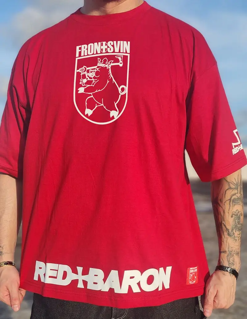
Long before logos, there were shields. In medieval Europe a knight in armour was hard to recognise, so the shield carried a picture that told friend from enemy at a glance. Over time those pictures became a full visual language: coats of arms, with their own rules, colours and creatures. Eight centuries later, the same ideas are still doing quiet work on our T-shirts.
A language built for distance
Heraldry was designed to be read quickly across a field. That produced a few principles that still define good graphic design.
- Bold, simple shapes. A shield shows one or two clear symbols, never a crowd of tiny details.
- Strong contrast. Colours were chosen to stand out against each other.
- A limited palette. A coat of arms uses a handful of colours, not dozens.
If you look at a successful graphic T-shirt, you will find the same three ideas at work.
The rule that keeps shields readable
One of the oldest rules in heraldry is the rule of tincture. In simple terms: do not put colour on colour or metal on metal. The "metals" are gold (yellow) and silver (white); the "colours" include red, blue, green and black. A red shape on a white field is clear and sharp; a red shape on a blue field vibrates and is hard to read. That is why red and white works so well. The Red+Baron Fron+svin shirt, which is red and white, follows this old rule without needing to say so.
The best logos are the ones you could read from a galloping horse.
Beasts and what they mean
Animals were chosen for the qualities people wanted to claim: strength, speed, courage or cunning. Lions, eagles, boars and bears all appear again and again. The boar in particular stood for courage in battle, because a cornered boar fights with no thought of retreat. A war pig in a medieval coat is therefore not an odd joke; it belongs to a long tradition of fierce animals on shields. Red+Baron's version mixes that tradition with humour and a clear sport and military flavour, and the result is a design that is both historical and playful.
The shield as a frame
A shield is also a useful frame. It gives any picture a clean outline and tells the viewer that this image is a symbol, not just a drawing. Designers use the shape on chests, sleeves and caps because it concentrates attention. The same effect appears in badges and patches, which are cousins of the heraldic shield.
From battlefield to wardrobe
When uniforms and armour stopped being needed on the street, their visual language became style. Sports clubs adopted crests. Universities used shields. Streetwear combined the lot with military patches, flags and symbols from many places. What heraldry gives to this mix is discipline: a small set of rules that keep the result clear.
Reading a design: a quick method
When you see a graphic shirt, ask four questions.
- What is the main symbol? There should be one.
- How many colours are there? Two or three is usually best.
- Where does the eye go first? A good design leads it to the main symbol.
- Does it tell a story in a second? If you need a paragraph to explain it, it may be too complicated.
The Fron+svin shirt passes all four: a single animal, a red and white palette, a central shield and a clear message.
Wearing heraldic graphics today
Keep the outfit simple, as you would for any strong graphic. A red and white shirt looks good with dark trousers, plain shoes and no other patterns. If you want to emphasise the historical flavour, add a cap or a jacket in a muted colour such as olive or dark grey. Avoid combining several loud symbols; a single shield is enough.
A short glossary of heraldic terms
You do not need to be a historian to enjoy heraldic design, but a few words make it easier to read.
- Escutcheon: the shield itself, the surface that carries the picture.
- Charge: the main symbol on the shield, such as an animal, a tool or a shape.
- Field: the background colour of the shield.
- Tincture: the name for the colours and metals used in heraldry.
- Crest: the figure placed above the helmet in a full coat of arms.
- Motto: a short phrase, often placed on a ribbon below the shield.
Once you know these terms, a graphic T-shirt starts to read like a small coat of arms: a field, a charge and sometimes a motto.
Heraldry in everyday objects
Heraldic thinking is all around us. Football clubs, universities, car makers and cities use shields, animals and crests to say who they are in one glance. Sports shirts borrow the same grammar. Streetwear brands do the same, only with more humour and more freedom. When you wear a shirt with a shield on the chest, you take part in a very old habit of carrying your identity in a picture.
How to choose a heraldic design for yourself
- Pick a symbol you like. Animals, castles and weapons all have strong visual presence.
- Check the colour contrast. Two or three strong colours read better than many.
- Look at the layout. A centred shield on the chest works well on a T-shirt; smaller crests suit sleeves and caps.
- Consider the tone. Some designs are serious, others playful. Choose the one that matches your personality.
Mixing heraldic pieces with the rest of the wardrobe
Because heraldic graphics are bold, keep the supporting pieces simple. A plain dark jacket, straight trousers and clean shoes are enough. If you like layering, put a heraldic T-shirt under an open overshirt in a muted colour such as olive or grey, so the shield remains visible. Avoid wearing several different crests at the same time, because the effect is stronger when there is one clear symbol.
Why the old rules still work
Human eyes have not changed in eight hundred years. We still notice contrast, simple shapes and recognisable animals first. That is why a coat-of-arms idea feels natural on a modern T-shirt, and why a design built on these rules ages well. It was never tied to a season or a trend.
Care for a printed shield
Graphic prints are happiest in cold water, inside out, with an air dry and no ironing over the design. Our care checklist explains why. A clean, sharp print keeps the heraldic contrast that the design relies on.
Where to see the design
The Fron+svin T-shirt is part of the Red+Baron collection, together with other designs that borrow from medieval, military and sport traditions. Each is handmade and upcycled, so no two are identical.
FAQ
What is heraldry?
Heraldry is the system of designing and describing coats of arms, using shields, colours and symbols that identify a person or a family.
What does the Fron+svin design show?
The Red+Baron Fron+svin T-shirt is red and white and shows a medieval military coat styled war pig.
Are heraldic designs only for history fans?
No. The visual language of shields and animals is simple and strong, which is why it suits everyday graphic clothing.